Piper Inc. is an education technology company that creates a computer kit for children ages 8-13 and we prioritize B2B sales toward schools and education. Our product focuses on teaching how to create circuits and control hardware components using code. The kit is a real-world and digital experience, from building the kit, to assembling electrical components, to writing code with Google Blockly to control those components. We released a product called the Sensor Explorer kit as an add-on to the computer kit where kids learn how to use sensors in their coding adventure. The following is the development of the UI for Sensor Explorer’s story mode menus.
I began working on this portion of the project in the middle of development when a lot of the UX decisions were already decided. It was not possible to make large flow changes, so I focused on what patterns I could reinforce and develop within each set of screens. Exploration and development of art assets were sketched out and designed within the span of approximately 6 weeks.
My Role and Duration
Tools and Methods
Usability Testing, Heuristic Analysis, Competitive Analysis, Sketching, Wireframes, Prototyping, Vector art for polished UI, Sketch, Figma, Adobe Photoshop and Illustrator
Project Goals
Create UI assets for Story Mode’s menus according to new brand direction the company is heading towards.
improve minor usability issues within each screen without adjusting the overall screen flows.
Art Direction
When I began the project, I was provided Piper’s brand guidelines and was also told it was a mixture of 80s Retro and 90s Memphis styles. Piper’s Story Mode experience is also made in Minecraft Pi Edition. It was decided menu-designs would be a mid-point between Piper and Minecraft’s style.
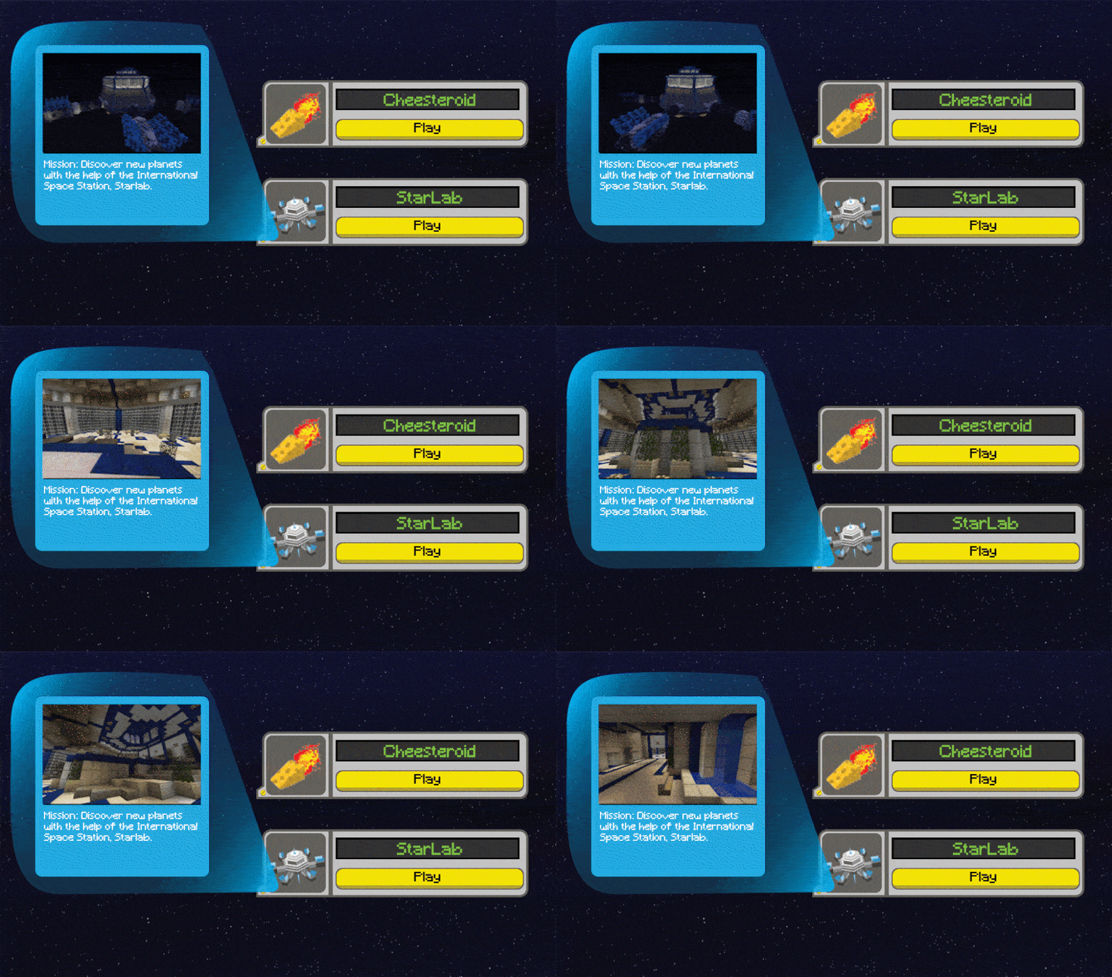
Chapter Menu
The focus in the Sensor Explorer release was the “StarLab” Chapter of Story Mode. We wanted to save the style change in this release for when they enter into the Star lab section. se we kept the background from the previous experience, but this is where we began to introduce hovers. We planned to eventually circulate this look into the original experience.
StarLab Map
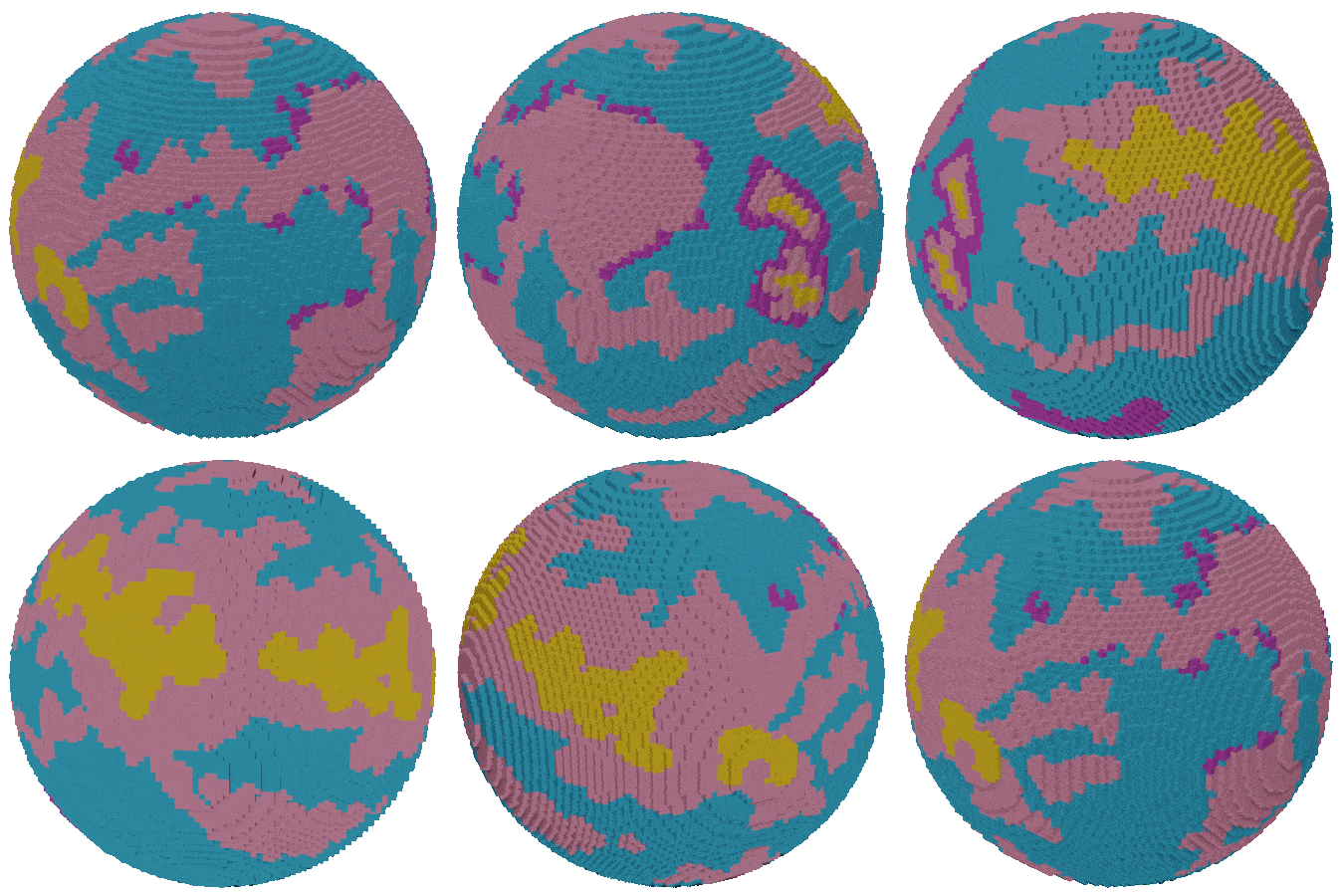
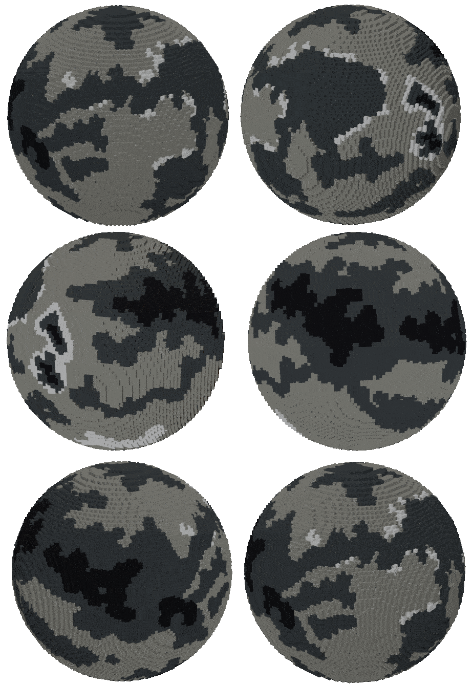
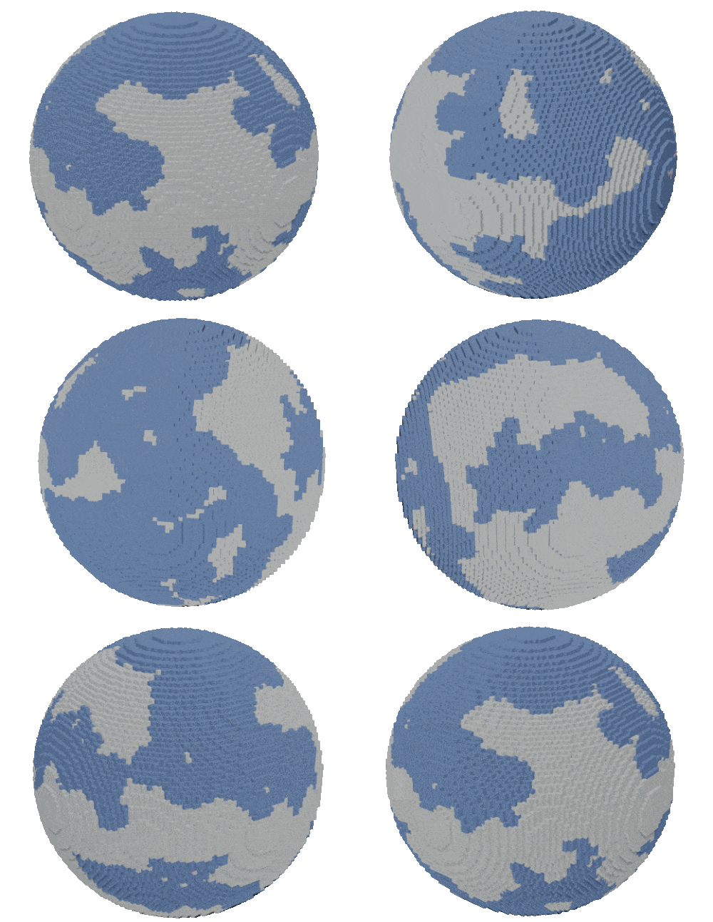
The prior story mode map is a long scrolling experience. As we began building the new map, it was decided that we should have the map be a fixed screen with all the levels showing the big picture progression. This design provided a view of the adventure that awaits the kids and showed their sense of progression through the story as a whole. We also have a point in the story where they visit a planet, leave to go to another planet and then return to that previous planet, so having it all appear on one screen helped facilitate that planet jumping.
Some visual signals for progression were also added in this screen. Check-Marks, Stars and Locks to convey to the player what the’ve done, what they need to do next and what they will be able to do in the future.
Minecraft models by John Chen
The user arrives to these screens by clicking on planets that are active. Since StarLab story mode is an experience that relies on the use of the Sensor Explorer Kit which is an add-on purchase to the base experience, we wanted to make sure the user wouldn’t be confused why they couldn’t progress in these levels if they didn’t have them. The dialogue box at the bottom right and a hover over story mode appears to make sure they understand this.
Level Details
The second time they arrive on these screens after they finish the story mode levels, those warnings are gone. We have confirmed they have used the Sensor Explorer Kit and they know thats a necessary part of the experience.
I learned a lot about working with a cross-disciplinary team with unique technology that had many limitations and the above are temporary solutions to problems within this specific section of the overall experience. I learned a lot about focusing on what I could adjust within the span of a concentrated project. Moving forward, as we look at the entire product as a whole we will continue to question whether these are the correct solutions to circulate or solve the larger UX issues our users are having.


